Branding
Pablo brand assets
Logo files, colors and a few simple rules – for bot lists, videos, articles and community posts.
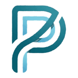
The mark
The Pablo mark is a “P” built from two interlocking ribbons: a deep teal outer line and a lighter sky-blue inner line. It stands for Pablo’s idea of bringing many server tools together into one calm, connected experience.
Name: Pablo · Tagline: Your Discord. Smarter.
Downloads




Colors
Deep Teal
RGB 39, 130, 147
Primary – outer strokes of the mark
Sky
RGB 119, 201, 222
Accent – inner strokes and highlights
Night
RGB 15, 17, 21
Background for icons and dark surfaces
White
RGB 255, 255, 255
Background on light surfaces
Please do
- Use the transparent logo on plain, calm backgrounds.
- Keep clear space around the mark of at least a quarter of its width.
- Use the app icon versions where a square, filled icon is needed (e.g. server lists).
- Write the name as “Pablo” – capital P, rest lowercase.
Please don’t
- Stretch, rotate or skew the mark.
- Recolor the mark or add effects like outlines, shadows or glows.
- Place it on busy images or colors with low contrast.
- Use the logo in a way that suggests an official partnership or endorsement.
Pablo is not affiliated with Discord Inc. “Discord” and the Discord logo are trademarks of Discord Inc.